

The editor — build and style your pages
The editor is where you design every page of your app. Everything is visual: drag things onto the page, click to select, and change them in the panel on the right.
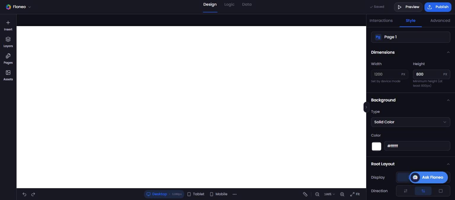
Editor layout
| Area | Where | What it does |
|---|---|---|
| App menu (FloNeo logo ⌄) | Top left | Back to Home, My Projects, Templates, Help, Theme, Logout |
| Design / Logic / Data | Top centre | Design is where you build. Logic and Data are coming soon. |
| Save status · Preview · Publish | Top right | Autosave status, open a preview, put your app live |
| Left rail | Left | Insert, Layers, Pages, Assets |
| Canvas | Centre | Your page |
| Properties panel | Right | Interactions, Style, Advanced for whatever is selected. Hide it with the › handle. |
| Bottom bar | Bottom | Undo/redo, Desktop/Tablet/Mobile, more sizes (⋯), ruler, zoom, Fit |
| Ask Floneo | Bottom right | Chat with NEO about your page → Ask NEO |
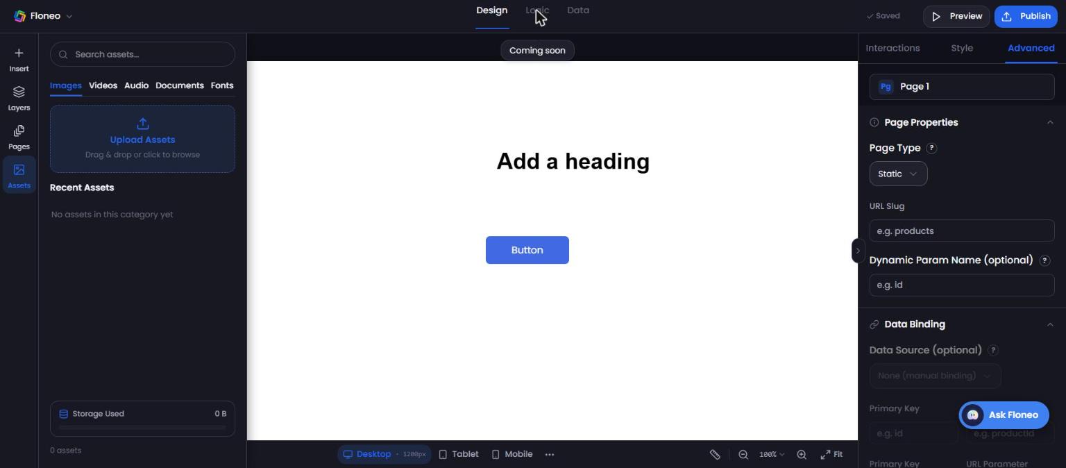
1. Insert — add things to your page
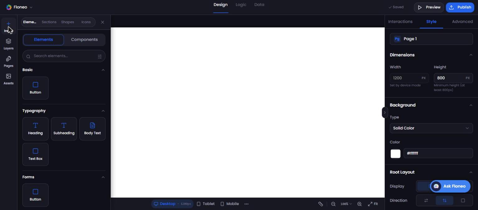
Click Insert (+) in the left rail. There are four tabs.
Elements
Drag an element onto the canvas, or click it to drop it on the page. Search with Search elements…
| Group | Items |
|---|---|
| Basic | Button |
| Typography | Heading, Subheading, Body Text, Text Box |
| Forms | Button |
| Navigation | Coming soon |
| Embed | Coming soon |
| Utility | Frame, Divider, Container, Section, Sidebar |
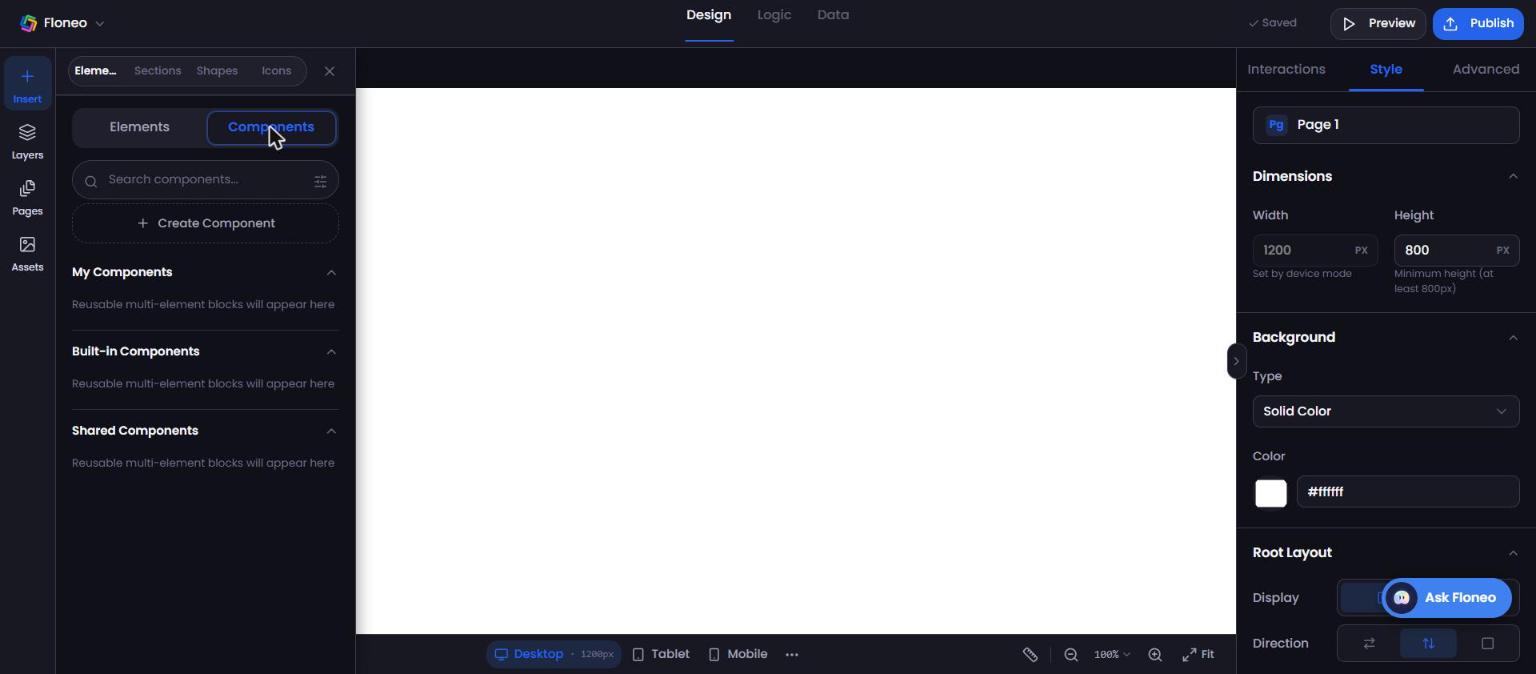
Components
Reusable blocks made of several elements. Create Component to save your own. Groups: My Components, Built-in Components, Shared Components.
Sections
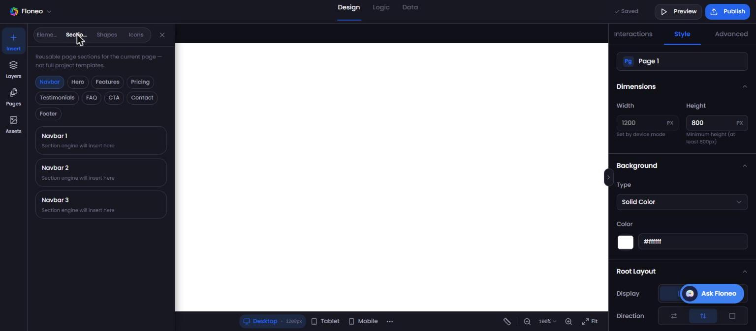
Ready-made page sections for the current page (not full templates). Categories: Navbar, Hero, Features, Pricing, Testimonials, FAQ, CTA, Contact, Footer — each with several layouts.
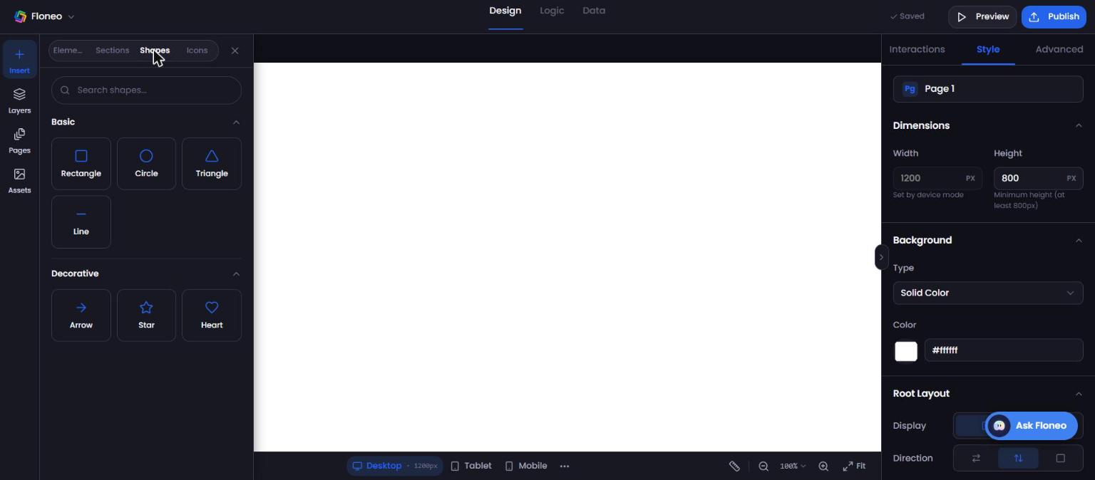
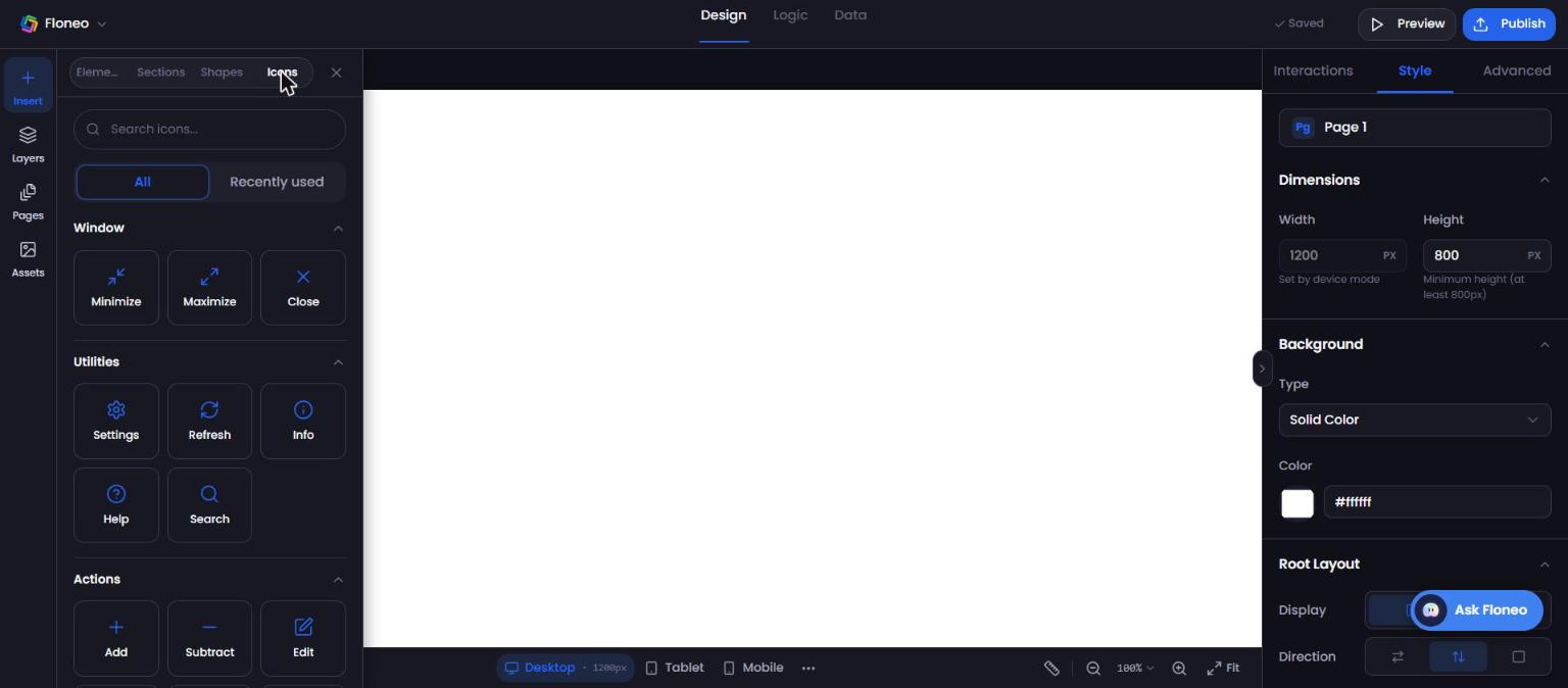
Shapes and Icons
- Shapes: Rectangle, Circle, Triangle, Line, plus decorative Arrow, Star, Heart.
- Icons: searchable library grouped by Window, Utilities, Actions and more, with a Recently used tab.
2. Select and edit an element
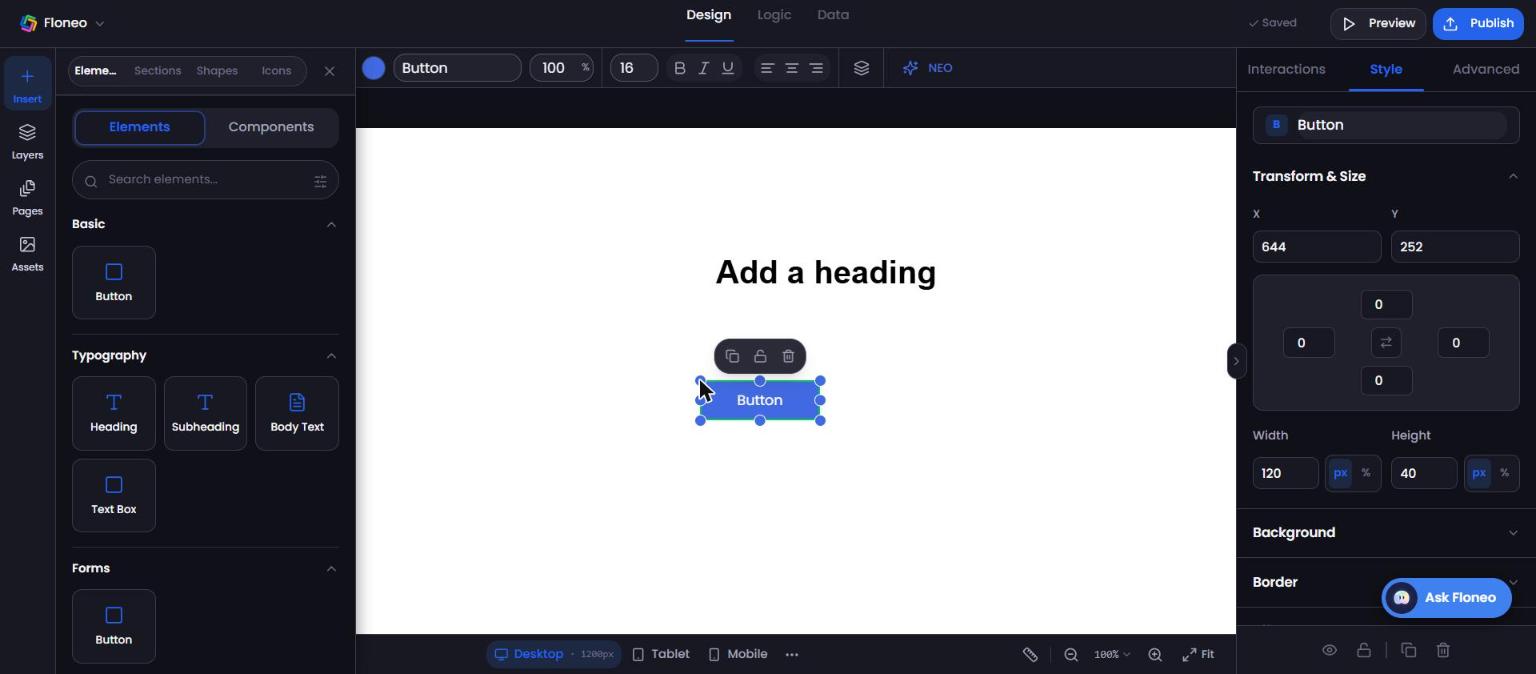
Click any element to select it. You'll see:
- Resize handles around it.
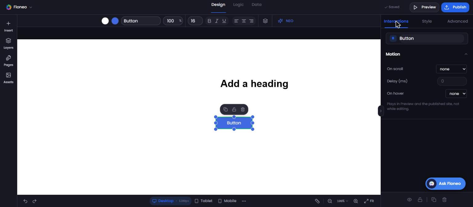
- A small floating toolbar: Duplicate, Lock, Delete.
- A top toolbar: text/fill colour, font, size, opacity, B / I / U, alignment, layer order, and NEO (ask AI about this element).
Double-click text to edit it directly on the canvas.
Properties panel (right)
| Tab | What's inside |
|---|---|
| Style | Transform & Size (X, Y, rotation/position, width/height in px or %), Background, Border, Effects |
| Interactions | Motion — On scroll: none, fade, fade-up, scale-in, zoom-in, slide-left, slide-right; Delay (ms); On hover: none, lift, grow. Motion plays in Preview and on the published site, not while editing. |
| Advanced | Position, Typography, Data Binding, Basic Content (Element name, Section ID, text, Type: Normal / Nav Button) |
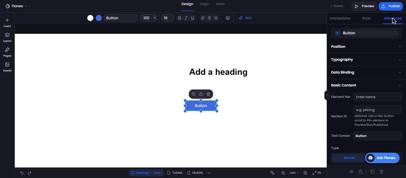
💡 Make a menu button scroll to a section: give the target section a Section ID (e.g.
pricing), then set your button's Type to Nav Button and point it at that ID. Works in Preview and on the live site.
Page settings (nothing selected)
Click an empty part of the canvas to edit the page itself:
- Style: page height (minimum 800px; width is set by the device mode), background, Root Layout (display, direction, padding), Sync Across, Default Visibility.
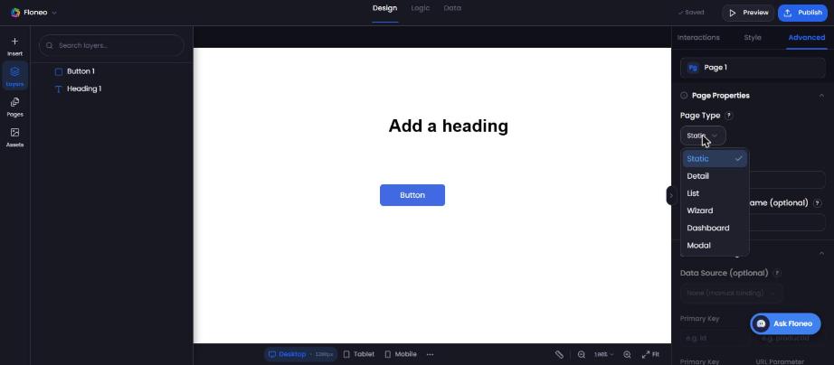
- Advanced → Page Properties: Page Type (Static, Detail, List, Wizard, Dashboard, Modal), URL Slug, Dynamic Param Name; Data Binding (data source, primary key, URL parameter); Security — Requires Auth (only signed-in users see the page) and Hide After Login (e.g. hide Login/Signup once signed in).
3. Layers — arrange what's on the page
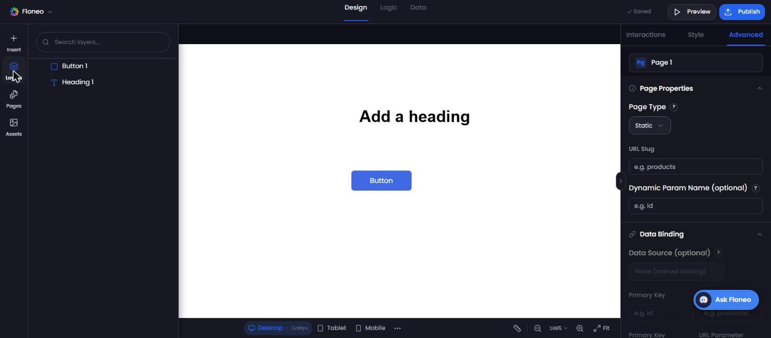
Layers lists every element on the page. Click to select, drag to reorder, search with Search layers…
- Bring forward / send backward: Ctrl/⌘ + ] and [
- To front / to back: Ctrl/⌘ + Shift + ] and [
- Group / ungroup: Ctrl/⌘ + G / Ctrl/⌘ + Shift + G
- Lock / hide: Ctrl/⌘ + L / Ctrl/⌘ + H
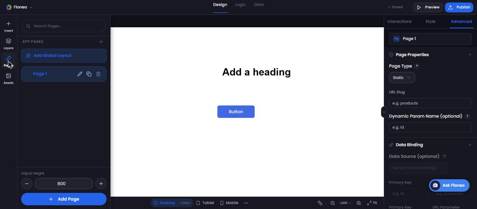
4. Pages — add and manage pages
Pages shows all pages in your app.
- Add Page (bottom) or Ctrl/⌘ + N. Or the + next to App Pages.
- Each page has Rename ✎, Duplicate ⧉ and Delete 🗑.
- Add Global Layout — a shared layout (like a header and footer) used across pages.
- Adjust Height — make the current page taller or shorter with − / +.
- Jump between pages with number keys 1–9.
5. Assets — your images, videos and files
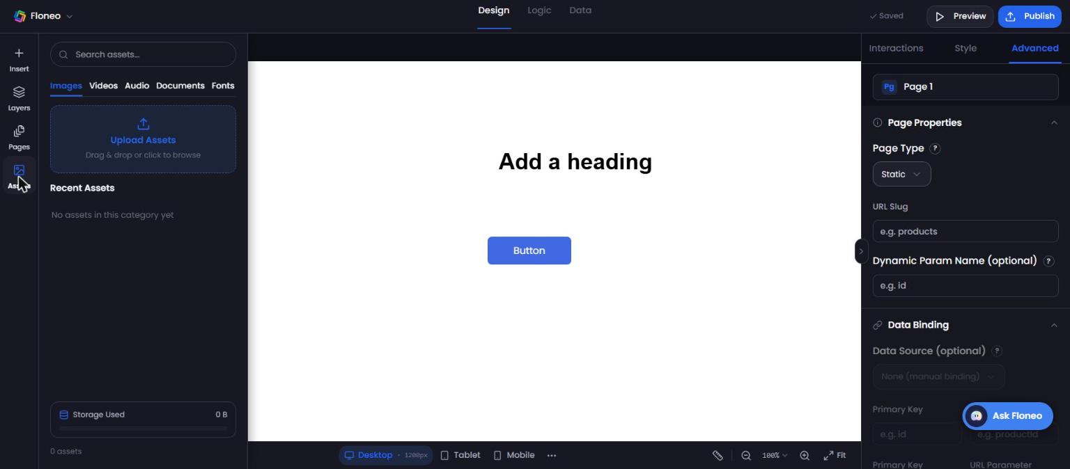
Assets stores files you upload so you can reuse them anywhere in the app.
- Tabs: Images, Videos, Audio, Documents, Fonts.
- Upload Assets — drag and drop or click to browse. Then drag the asset onto the canvas.
- Storage Used shows how much space your assets take.
6. App menu
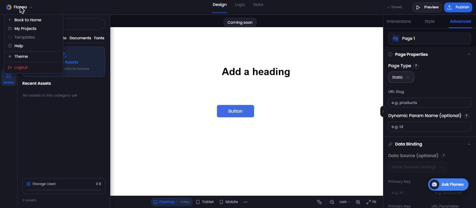
Click the FloNeo logo (top left): Back to Home, My Projects, Templates (coming soon), Help (opens in-app help), Theme (light/dark), Logout.
Undo, zoom and view
- Undo / Redo: arrows bottom-left, or Ctrl/⌘ + Z / Ctrl/⌘ + Shift + Z (also Ctrl + Y).
- Zoom: − / + or the % menu; Fit shows the whole page; Ctrl/⌘ + 0 resets.
- Pan: hold Space and drag.
- Ruler icon toggles rulers.
All shortcuts: Keyboard shortcuts
Didn't find your answer? Contact support